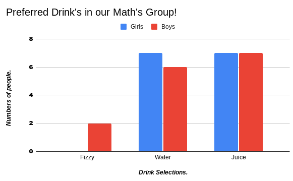
Today in maths we gathered data and used Google spreadsheets to make a column graph, Our topic was preferred drink’s and our variables and was genders. I noticed that girls preferred Water and Juice equally and boy’s preferred Juice the most. Fizzy drinks were the least popular with only two boys. I chose to do a bar graph because it was easier to show the data we collected.
